Explore new features on the Scopus Search Results Page
The redesigned Scopus Search Results page is now live! As part of our mission to improve user ease of use, we have redesigned the Scopus Search Results page. The improved functionality was fueled by customer feedback and the product team's commitment to continually improving and includes:
- Search functionality on the search result page itself
- User-friendly filters/facets and customized different views on how the results are displayed
- An aesthetically pleasing and intuitive page layout
Here is what is new on the search results page
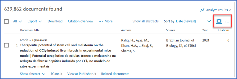
Toggle between the list view and the table view of the results
When displaying the search results, users can now switch between the table and list view. The table view will be set as the default.
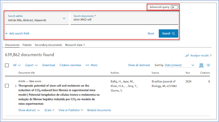
Basic search form is now accessible from the search results page (as well as the home page)
We have made it possible for users to edit their query from within the search results page. It is no longer needed to go back to homepage to make edits to the basic search query. Instead, users can toggle between the basic search form and the advanced search form. The basic search form view is set as the default. To edit the query from the advanced search mode, the user needs to go to the advanced search page.
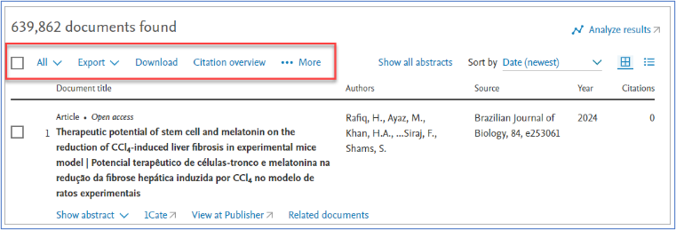
Improvement to the toolbar
The toolbar actions now always show up as “enabled”. In the previous interface, the toolbar actions were disabled until the user selected one or more results from the list.
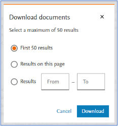
Now, when users select an action on the toolbar and no result(s) are selected, the user will be asked to select the maximum allowed number of results; all results on the page; or a range of results.
Improvement to search filters & facets
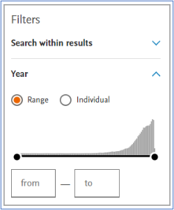
Within the search result filters, the facet to select years is now more intuitive, with a graph that indicates the number of publications per year. It is also possible to select a specific dates range.
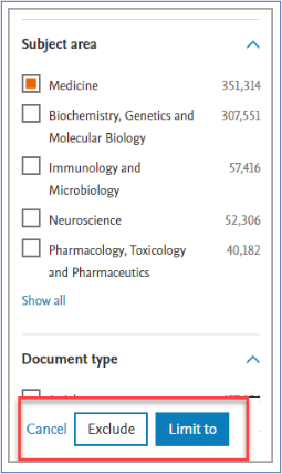
It is now easier to apply filters and/or remove selected filters. A pop-over with Exclude/Limit to appears as the user interacts with the filters, instead of having to scroll to the bottom of the facet menu.
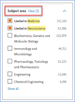
There is no longer a need to go to advanced search to remove the filter selection, as the user can clear the selection directly from the facet menu.


