A new look for Scopus
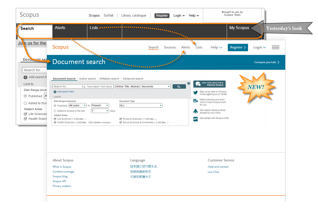
Have you seen Scopus lately? If so, then you probably noticed the refreshed look. If not, then we encourage you to go and open Scopus now. Aside from the more modern look and feel, there are also some functional changes we would like to bring to your attention.To help quickly bring you up to speed, here is a side-by-side comparison between the former version and how it looks today (click on the images to enlarge).
- The Scopus home page (Scopus.com) still opens to the search form; however, if you are looking for your ‘Alerts’ and ‘Lists,’ you’ll now find them in the header. If you don’t use ‘Alerts’ and ‘Lists,’ perhaps now is a good time to register and try them out.
- To browse and explore content sources in Scopus (i.e., journals, books, conference proceedings, trade publications), you’ll now find that the former ‘Browse Sources’ link has moved to the page header and is called ‘Sources.’ If you want to compare journals across multiple performance metrics, look for the ‘Compare journals’ link in the main blue ‘Document search’ bar.
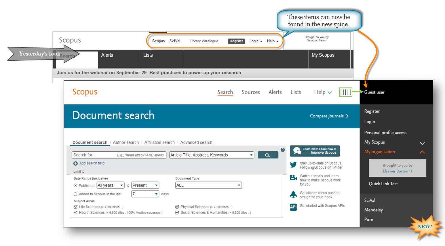
- With the changes to the header and navigation bar, some items — SciVal, Library catalogue, Register, Login and My Scopus — have now been moved to a new spine.
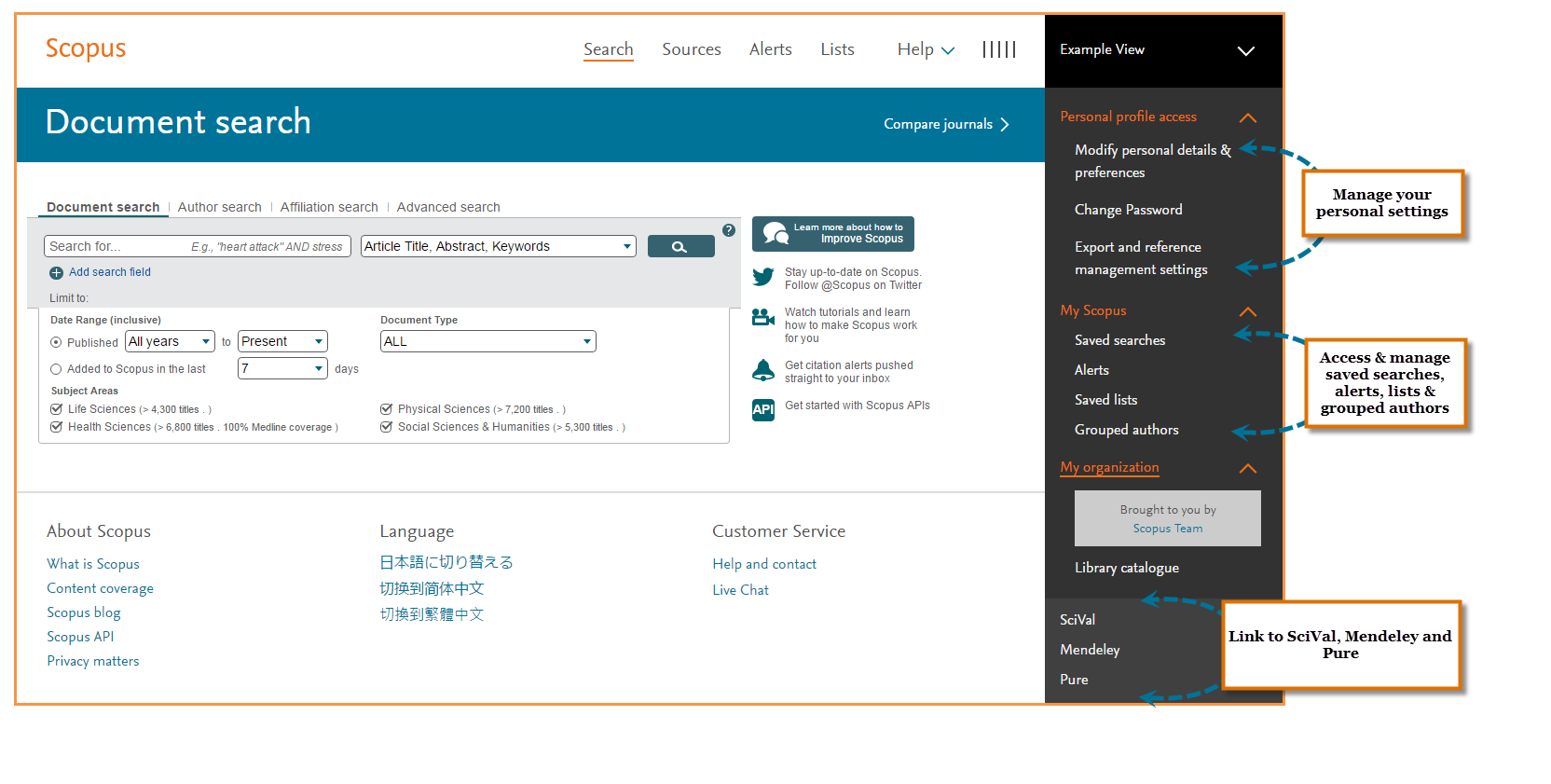
The spine contains all of the Scopus personalization features and is easier to access. Go here to manage your settings, access any saved searches, modify your alerts and more. You can also link out to SciVal, Mendeley and Pure.
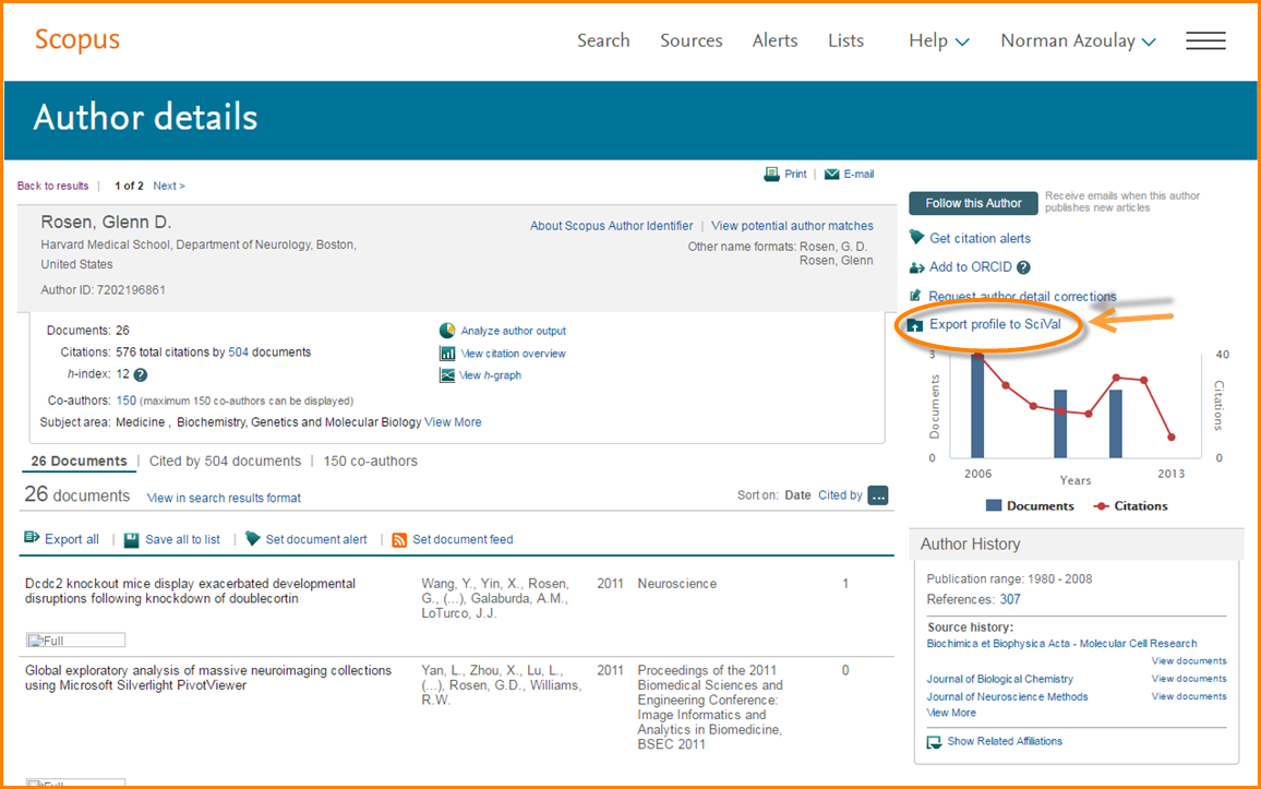
- One last update to point out applies to SciVal users.From the 'Author details' page, you can now export an author’s Scopus profile into SciVal.
These changes mark the start of further workflow improvements to come.To stay up-to-date with more product news or updates, sign up for our monthly newsletter.


