PlumX Metrics soon to be integrated on Scopus: How will it help you tell the story of your research?
Since it was first announced in February 2017 that Plum Analytics was joining Elsevier, the Plum Analytics and Scopus teams have been working together to integrate PlumX Metrics as the primary source of article-level metrics on Scopus (along with other Elsevier platforms and products), replacing metrics previously provided by Altmetrics.com. With the integration now just around the corner, here is an overview of what PlumX Metrics are to prepare you for the type of insights you will soon be able to find on Scopus.
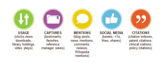
PlumX Metrics is Plum Analytics’ comprehensive, item-level metrics that provide insights into the ways people interact with individual pieces of research output (articles, conference proceedings, book chapters, and many more) in the online environment. To support like-with-like analysis and help make sense of the huge amounts of data involved (check out the metrics sources here), they are divided into five categories:
- Usage: A way to signal if anyone is reading the articles or otherwise using the research. Usage is the number one statistic researchers want to know after citations.
- Captures: Indicates that someone wants to come back to the work — can be a leading indicator of future citations.
- Mentions: Measurement of activities such as news articles or blog posts about research — a way to tell that people are truly engaging with the research.
- Social media: This category includes the tweets, Facebook likes, etc. that reference the research. Social Media can help measure “buzz” and attention. Social media can also be a good measure of how well a particular piece of research has been promoted.
- Citations: This category contains both traditional citation indexes such as Scopus, as well as citations that help indicate societal impact such as Clinical or Policy Citations.
Soon you will begin seeing these metrics and the Plum Print on Scopus, adding a more comprehensive and holistic view of an article’s research impact. Stay tuned over the next several weeks to learn more and begin using PlumX Metrics to help tell the story of your research.


