Scopus Author profiles are now mobile friendly!
We have now made Scopus Author Profiles fully mobile responsive, so that researchers can track their performance, and search for experts and collaborators, from anywhere, at any time. Smartphone usage for research is increasing rapidly and our team received user requested for an improved mobile experience. Research into Scopus usage showed that mobile use is disproportionately important for the author profile viewing; 11% of customer visits to the author profile are on mobile, as well as 27% of Preview visits. Learn about the changes below and simply navigate Scopus from your mobile device to see the improvements for yourself.
How was the mobile experience improved?
The key features and benefits of this release are:
- Mobile-friendly design: The Scopus author profile now automatically adjusts to fit the screen of any mobile device or smaller screen, allowing researchers to use our profiles with ease on the go.
- Improved user experience: The new responsive designs make it easier to navigate and interact with Scopus Author Profiles, with optimised layouts, menus and controls for the small screen.
- Enhanced accessibility: With the new responsive design, we ensure that our profiles can be used effectively by anyone.
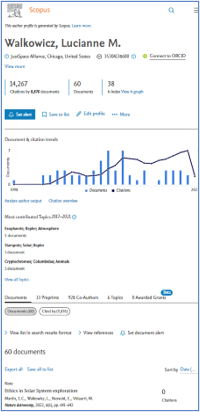
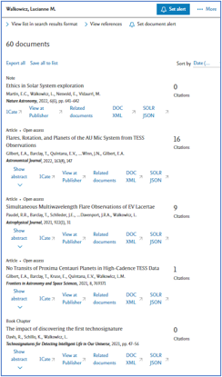
What does the improved mobile interface look like?
The New design with vertically stacked components, and a sticky header provides easy access to key actions.


